
- Prepare your Schema
- Prepare your Catalog
- Upload your Feed
- Full Feed Upload
- Delta Feed Upload
- Single Record Upload
- Check Product Count

- Search Endpoint
- Authentication
- Header
- Request Parameter
- Response Components
- Explanation Request Parameter
- PDP API Format
- Sample Request
- Request Parameters
- Response Parameters
- System Requirements
- Install SDK
- Initialize SDK
- Unbxd Commerce Search
- Integrating Unbxd Autosuggest
- Unbxd Analytics
- Unbxd Browse
- Unbxd Recommendations
- Sample App
- Installation
- Unbxd Analytics
- Unbxd Commerce Search
- Unbxd Autosuggest
- Unbxd Browse
- Unbxd Recommendations
- Sample iOS App
- Quickstart with Unbxd Template
- Quick Integration to your site
- Detailed Guide
- Authentication
- Types of Pages to Render
- Configuring the Page
- Instance Methods
- More Information
- Available Configurations
- Libraries
- QuickStart
- Authentication
- Configuring Autosuggest
- Sample Options Object
- Handlebar Functions
- List of Configs
- Search Template
- Loader Config
- Facet Config
- Pagination
- Spellcheck
- Sort Config
- PageSize Config
- Breadcrumb Config
- Product Views
- Variants
- Quick Integration with Unbxd template
- Quick Integration to your site
- Installation
- Authentication
- Types of pages to render
- Configuring the page
- PageSize Config
- More Info
- Endpoint
- Authentication
- Headers
- Request Parameters
- API Response
- Response Components
- Create an Unbxd Account
- Create an Unbxd Site
- Upload a Catalog
- Setup Search
- Integrate Search
- Create an Unbxd Account
- Create an Unbxd Site
- Upload a Catalog
- Setup Search
- Integrate Search
- Plugin Installation
- Configuration
- Uninstallation
- Test Plugin Installation
- Installation
- Authentication
- Catalog
- Catalog Sync
- Product Integration
- Custom Template
- Indexing Queue View
- Feed View
- Upgrade
- Uninstall
- Installation
- Authentication
- Catalog
- Cron Job
- Product Config
- Uninstall
- Installation
- Configuration
In the following sections, we will discuss how to configure and render each of these features with the Unbxd Search JS Library.
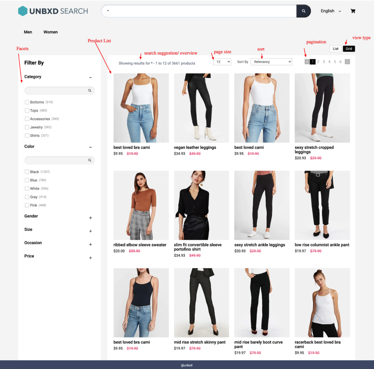
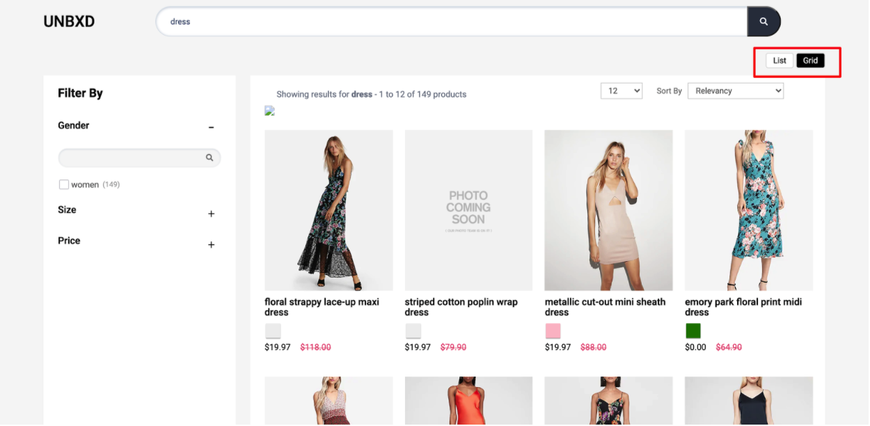
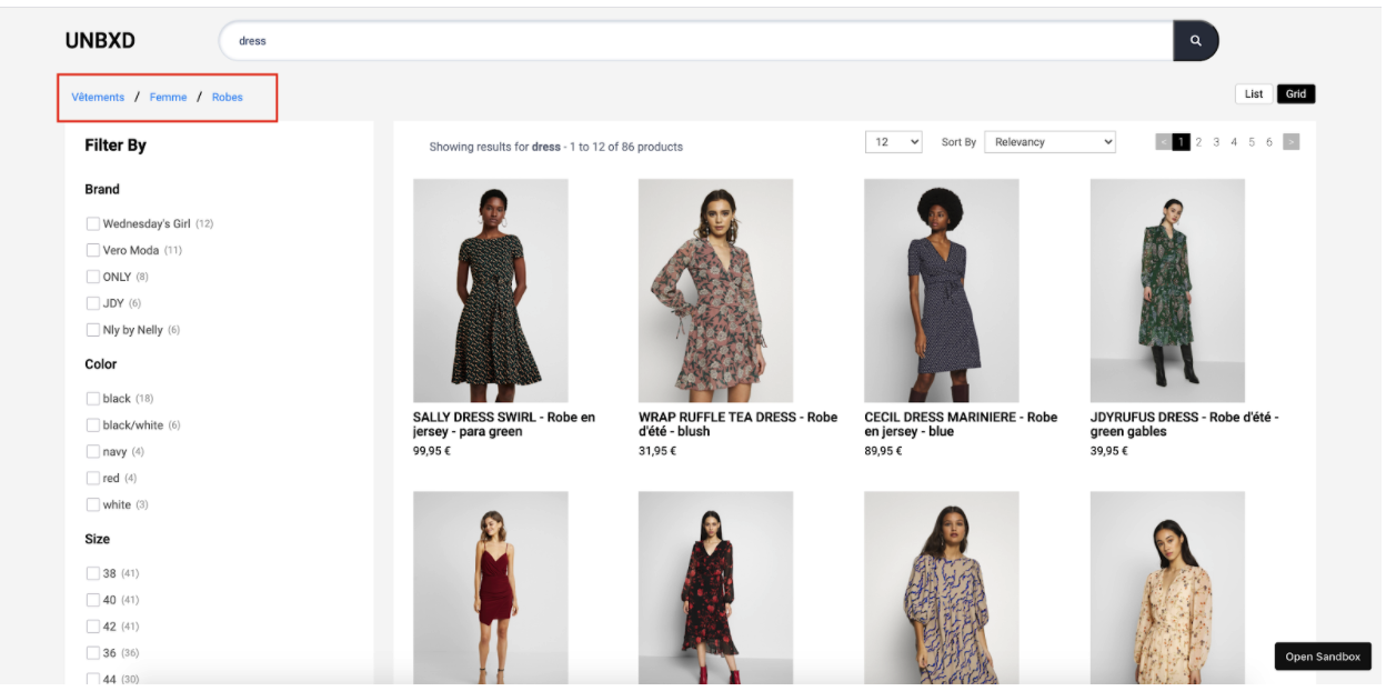
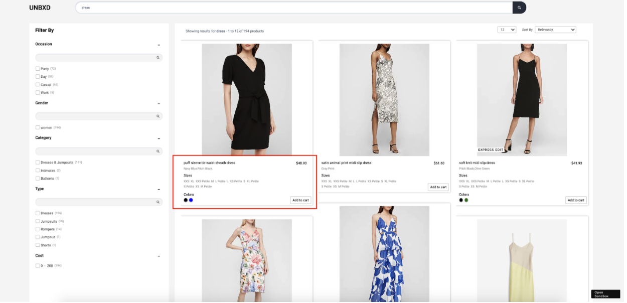
Search Results/Product Options
This is the place where products from the search results will be rendered.

You can configure the search results section by updating the required configs under the “products” config
The following are the various options available under the “products” config object:
|
OPTIONS |
DATATYPE |
DEFAULT VALUE |
DESCRIPTION |
|
productType |
String |
“SEARCH” |
Type of products page to render. Accepted values are SEARCH or BROWSE or CATEGORY |
|
el |
Element |
null |
Element in which to render the search results |
|
template |
Function |
Customise the look and feel of the product card by returning your custom HTML string from this function. This function gets 5 parameters: complete product object and index of the current product, swatches, selected view type, product config |
|
|
productAttributes |
Array |
[“title”, “uniqueId”, “price”, “sku”, “imageUrl”, “displayPrice”, “salePrice”, “sortPrice”, “productDescription”, “unbxd_color_mapping”, “colorName”, “color”] |
This is an array of all required fields for generating the result template. This is helpful to load the results faster. |
|
attributesMap |
Object |
{“unxTitle”: “title”,”unxImageUrl”: “imageUrl”,”unxPrice”: “salePrice”,”unxStrikePrice”: “displayPrice”,”unxId”: “uniqueId”,”unxDescription”: “productDescription”} |
Field mappings for the data to be displayed in the product card |
|
gridCount |
Number |
Adjusts as per screen size |
If you want to have grid type user interface, then you can configure how many columns you want to have in a row with this config. By default it will adjust according to screen size. |
|
productItemClass |
String |
“product-item” |
Additional class name to be added to each product card |
|
onProductClick |
Function |
function(product, event) {} |
Callback functions called on click of a product card. This function gets the product object & the event object as params |
Sample “products” config:
products:{
       el: document.getElementById("searchResultsWrapper"),
       template:function(product,idx,swatchUI,productViewType){ return ``},
       productType:"SEARCH",
       gridCount:1,
       onProductClick: function(product,e) {
       },
       productAttributes: [
           "title",
           "uniqueId",
           "price",
           "sku",
           "imageUrl",
           "displayPrice",
           "salePrice",
           "sortPrice",
           "productDescription",
           "unbxd_color_mapping",
           "colorName",
           "color"
       ],
       attributesMap:{
           'unxTitle':'title',
           'unxImageUrl':'imageUrl',
           'unxPrice':'salePrice',
           'unxStrikePrice':'displayPrice',
           'unxId':'uniqueId',
           'unxDescription':'productDescription'
       }

   },
Read about products config more here
Sorting allows you to rearrange the search results based on certain fields in a particular order.
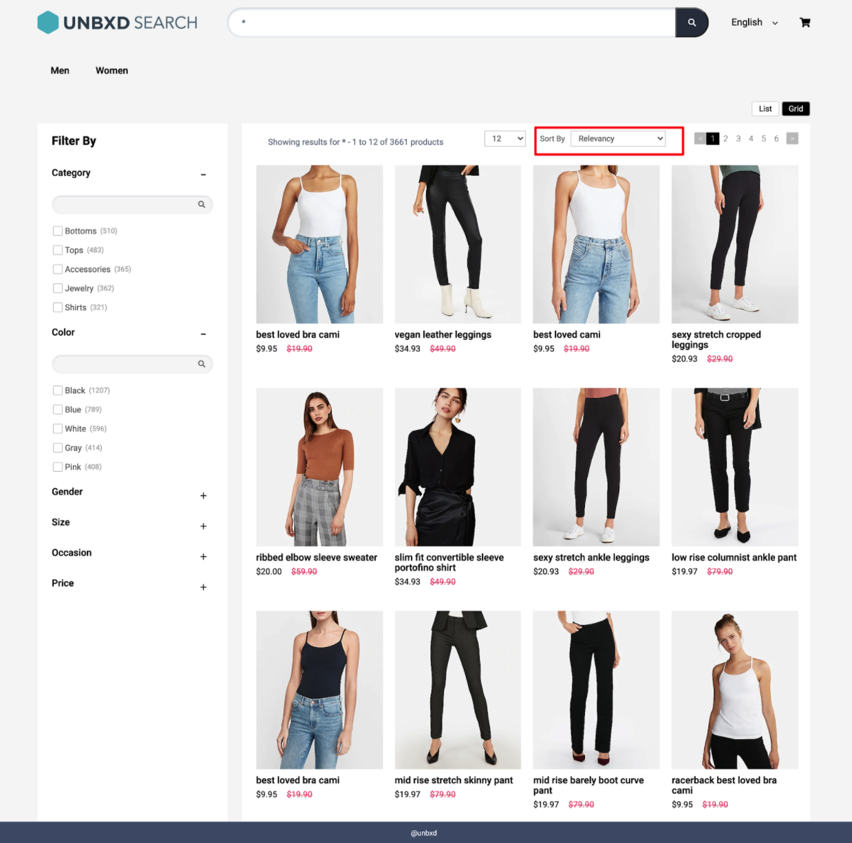
Pagination helps to control the number of products displayed on the page and the type of pagination (infinite scroll, click to scroll, or fixed pagination) to display.
Fixed Pagination
This traditional type of pagination displays the set number of products on one page.
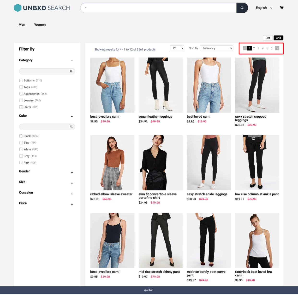
Click & Scroll

You can configure the pagination feature by updating the required configs under the “pagination” config object.
The following are the various options available under the “pagination” config object:
|
OPTIONS |
DATATYPE |
DEFAULT VALUE |
DESCRIPTION |
|
enabled |
Boolean |
true |
Turn this off if you do not want the pagination widget |
|
type |
String |
“CLICK_ N_SCROLL” |
Type of pagination: “FIXED_PAGINATION” or “INFINITE_SCROLL” or “CLICK_N_SCROLL” |
|
el |
Element |
null |
Element in which to render the pagination component |
|
template |
Function |
Customise the look and feel of the pagination by returning your custom HTML string from this function. This function gets 1 parameter: an object that has the pagination information |
|
|
pageClass |
String |
“UNX-page-items” |
CSS classname for the pagination component |
|
selected PageClass |
String |
“UNX-selected-page-item” |
CSS classname for selected page item |
|
onPaginate |
function (paginationInfo){} |
NA |
Callback function that gets called after a pagination action |
|
pageLimit |
Number |
6 |
Number of pages to show upfront (when type is FIXED_PAGINATION) |
|
infinteScroll TriggerEl |
Element |
window |
Element on which to detect infinite scroll page boundary (when type is set to INFINITE_SCROLL) |
|
heightDiffTo TriggerNextPage |
Number |
100 |
Height of the page to consider to fetch the next page data (when type is set to INFINITE_SCROLL) |
|
action |
String |
“click” |
Action on which pagination should trigger: “click” or “change” |
Sample “pagination” config
pagination : {
       enabled:true,
       el: document.querySelector("#clickScrollContainer"),
       template: function (paginationData, pagination) { return ``},
       pageClass:"UNX-page-items",
       selectedPageClass:"UNX-selected-page-item",
       type:'CLICK_N_SCROLL', // INFINITE_SCROLL or CLICK_N_SCROLL or FIXED_PAGINATION
       infinteScrollTriggerEl:window, //if paginationType = INFINITE_SCROLL
       heightDiffToTriggerNextPage:100, //if paginationType = INFINITE_SCROLL,
       onPaginate:function(paginationInfo){},
       action:'click',
       pageLimit:6
   }
Facets are the products filters provided on your webpage which allows customers to narrow down the search result set.
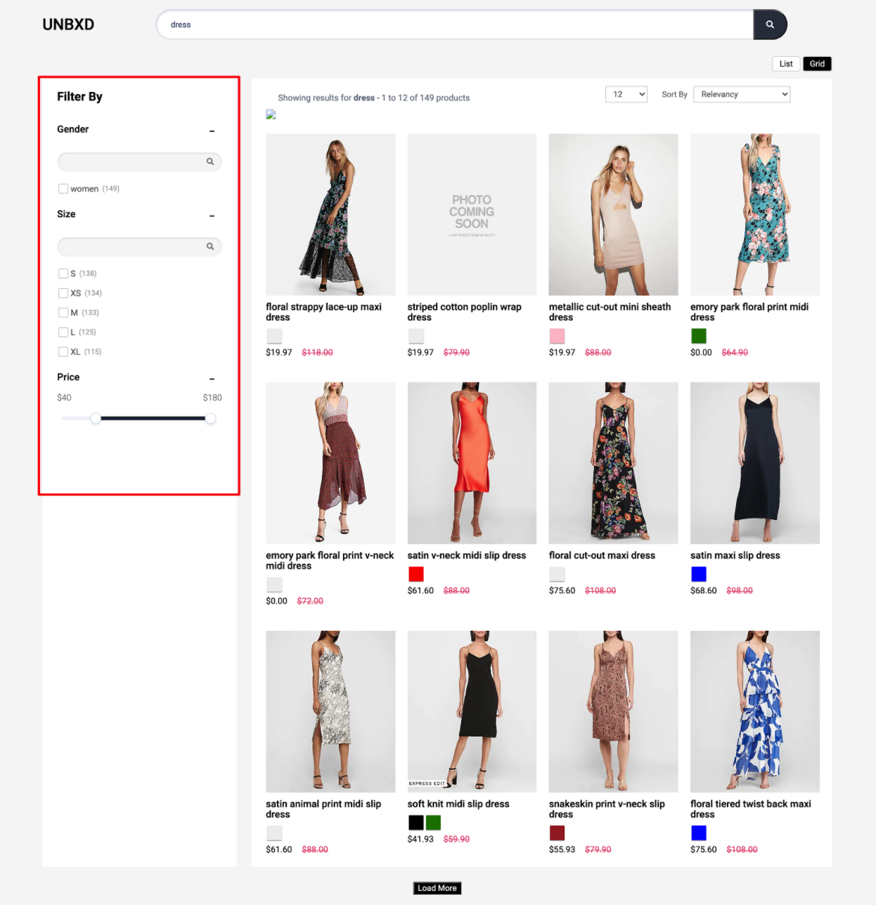
To render the facets on the search results page, you can use the “facet” config object to configure the various options.
|
OPTIONS |
DATATYPE |
DEFAULT VALUE |
DESCRIPTION |
|
facetsEl |
Element |
null |
Element in which to render the facets |
|
facetTemplate |
Function |
Customise the look and feel of the facets block by returning your custom HTML string from this function. This function gets 3 parameters: the complete facet block, facet values, is expanded flag (in case you have chosen collapsible facets, i.e. isCollapsible is set to true) and the search text entered for this facet block (if isSearchable is set to true) |
|
|
facetItemTemplate |
Function |
Customise each individual facet value by returning your custom HTML string from this function. This function gets 3 parameters: the complete facet block, the current facet value and the search text entered for this facet block. |
|
|
facetMultiSelect |
Booelan |
true |
Turn this off if you want to disable the multiple selection of facets |
|
facetClass |
String |
“UNX-facets-block” |
Additional CSS class name to add to the the facet items |
|
facetAction |
String |
“click |
Event based on which to trigger facet selection / deselection: “click” or “change” |
|
selectedFacetClass |
String |
“UNX-selected-facet-btn” |
Additional CSS class name for the selected facet items |
|
selectedFacetsEl |
Element |
null |
Element in which to render the selected facets. If you don’t provide this element selected facets will be rendered along with the facet blocks |
|
selectedFacetTemplate |
Function |
Customise the look & feel of the selected facets block by returning your custom HTML string from this function. This function gets 2 parameters: the selected facet complete block and the selected facet value |
|
|
selectedFacetItemTemplate |
Function |
Customise the look & feel of the selected facet by returning your custom HTML string from this function. This function gets 2 parameters: the selected facet complete block and the selected facet value |
|
|
clearAllText |
String |
“Clear All” |
The text to show for the clear all button that clears all selected facets |
|
rangeTemplate |
Function |
Customise the look and feel of the range facets by returning your custom HTML string from this function. This function gets 1 parameter: the list of range facets available |
|
|
rangeWidgetConfig |
Object |
NA |
Configure the default range slider. Refer to the “Facet Range Widget Config” section below to view the detailed configs |
|
facetMultilevel |
Boolean |
true |
Turn this on to send the multilevel parameter in the search API |
|
facetMultilevelName |
String |
“Category” |
Set the multilevel field name using this config |
|
multiLevelFacetSelectorClass |
String |
“UNX-multilevel-facet” |
Class name for each multi level facet item |
|
multiLevelFacetTemplate |
Function |
Customise the look and feel of multi level facets by returning your custom HTML string from this function. This function gets 3 parameters: the complete facet block, selected values and the search text entered for this facet block (if isSearchable is set to true) |
|
|
facetDepth |
Number |
4 |
Configure how many levels of category filter you want to have by setting this value |
|
clearFacetsSelectorClass |
String |
“UNX-clear-facet” |
Class name for the button to clear the selected facets |
|
removeFacetsSelectorClass |
String |
“UNX-remove-facet” |
Class name for the button to delete selected facets |
|
onFacetLoad |
Function |
function(facets) {} |
Callback function that gets called after each facet selection or deselection. This function gets all the facets as a parameter |
|
applyMultipleFilters |
false |
Boolean |
Turn this on if you want to apply multiple filters together |
|
applyButtonText |
String |
“Apply” |
The text to show for the apply button (when applyMultipleFilters is set as true) |
|
clearButtonText |
String |
“clear” |
The text to show for the clear button (when applyMultipleFilters is set as true) |
|
isCollapsible |
Boolean |
true |
Turn this off if you do not want to have a collapsible accordian for each facet block |
|
defaultOpen |
String |
“ALL” |
If “isCollapsible” is true, set this config to indicate the default open facet. Available options are “ALL” , “FIRST” , “NONE” |
|
isSearchable |
Boolean |
true |
Turn this on if you want to have search feature for each facet block |
|
searchPlaceHolder |
String |
“” |
Placeholder text for the facet search input |
|
enableViewMore |
Booelan |
false |
Turn this on for enabling view more or less functionality for individual facets |
|
viewMoreText |
Array |
[“show all”, “show less”] |
The text to show for the view more / less button. Pass the 2 strings in array format [, viewLessText]. Ex: [“View more”, “View less”] |
|
viewMoreLimit |
Number |
3 |
Will show view more only if the facet values are greater than this value |
Facet Range Widget Config
You can configure the range sliders by setting the “rangeWidgetConfig” object under the “facet” object. Range facets will be rendered automatically along with other facets if it is configured on the console dashboard.
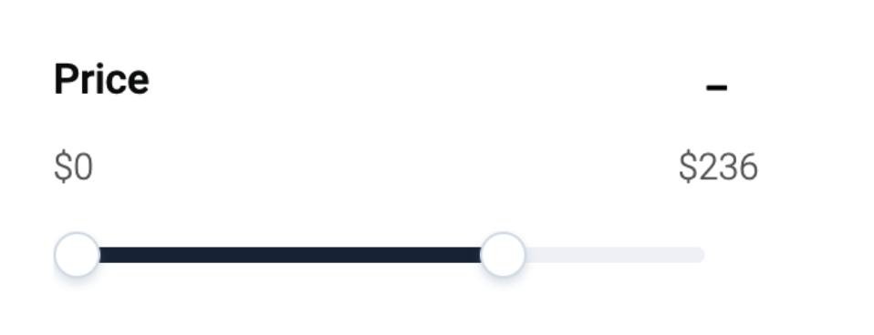
The following are the various options available for configuring the range widget
|
OPTIONS |
DATATYPE |
DEFAULT VALUE |
DESCRIPTION |
minLabel |
String |
“” |
Text for the lower end of the range slider |
maxLabel |
String |
“” |
Text for the higher end of the range slider |
prefix |
String |
“$” |
Prefix text to be added to the range widget value. Example “$” for price facet |
Sample “facet” config
 facet: {
       facetsEl: document.getElementById("facetsWrapper"),
       facetTemplate:function(facetObj, children, isExpanded,facetSearchTxt, facet){},
       facetItemTemplate:function(facet,value, facetSearchText){},
       facetMultiSelect:true,
       facetClass:"UNX-facets-block",
       facetAction:"click",
       selectedFacetClass:"UNX-selected-facet-btn",
       selectedFacetsEl:null,
       selectedFacetTemplate:function(selections, facet){},
       selectedFacetItemTemplate:function(selectedFacet,selectedFacetItem){},
       clearAllText:"Clear All",
       rangeWidgetConfig: {
           "minLabel":"",
           "maxLabel":"",
           "prefix":'$'
       },
       facetMultilevel:true,
       facetMultilevelName:"Category",
       multiLevelFacetSelectorClass:"UNX-multilevel-facet",
       facetDepth:4,
       clearFacetsSelectorClass: "UNX-clear-facet",
       removeFacetsSelectorClass: "UNX-remove-facet",
       onFacetLoad:function(facets){
       },
       applyMultipleFilters:false,
       applyButtonText:"Apply",
       clearButtonText:"clear",
       isCollapsible:true,
       isSearchable:true,
       searchPlaceHolder:"",
       textFacetWrapper:"UNX-facets-item",
       defaultOpen:"ALL",
       enableViewMore:false,
       viewMoreText:["show all", "show less"],
       viewMoreLimit:3
   }
Page Size widget allows you to configure the number of products shown on each page:
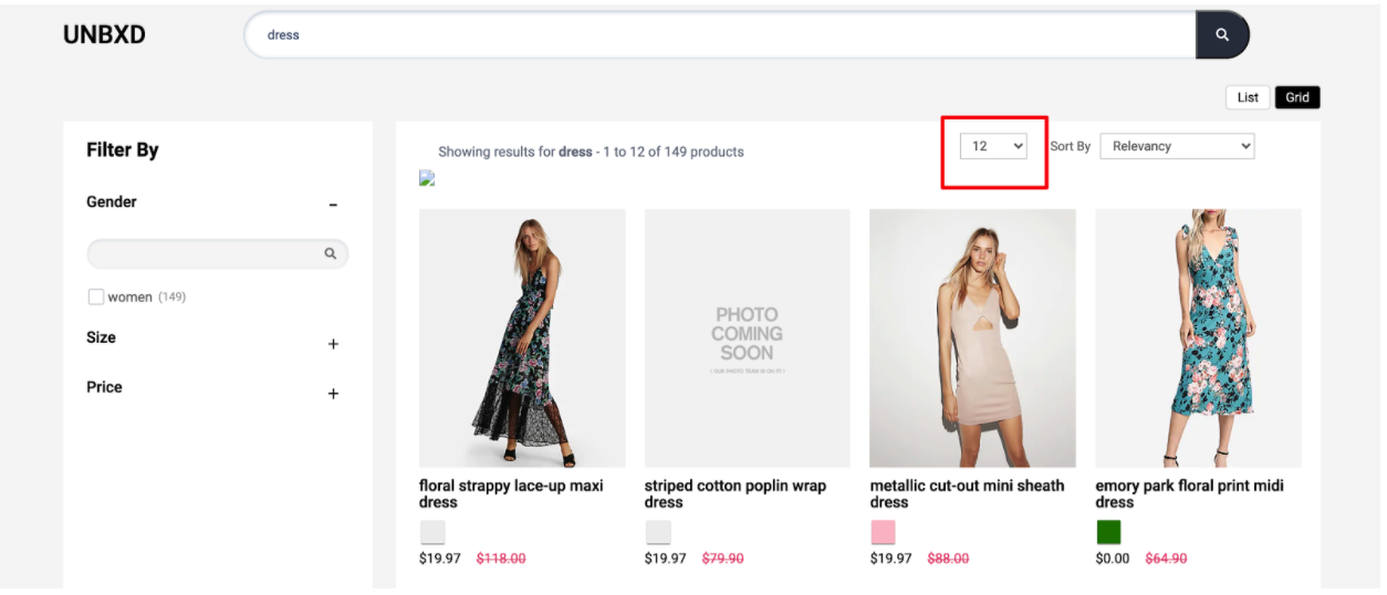
To render the Page Size widget, you need to configure the “pageSize” config object.
The following are the various options available under the object:
|
OPTIONS |
DATATYPE |
DEFAULT VALUE |
DESCRIPTION |
|
enabled |
Boolean |
true |
Turn this off if you do not want the page size component |
|
el |
Element |
null |
Element in which to render the page size element |
|
pageSize |
Number |
12 |
Number of results to be shown per page |
|
options |
Array |
[8, 12, 16, 20, 24] |
Array of desired page sizes to be rendered. It is suggested that the value be a multiple of number of columns (ex. if 3 columns then 15 or 18 or 21). |
|
pageSizeClass |
String |
“UNX-pagesize” |
Additional CSS class name to be added to the page size element |
|
selectedPageSizeClass |
String |
“UNX-selected-pagesize” |
Additional CSS class name to be added to the selected page size option |
|
action |
String |
“change” |
Action on which page size change should trigger: “click” or “change” |
|
template |
Function |
Customise the look and feel of the page size component by defining this function that is expected to return a HTML string for the template. This function gets 2 parameters: the selected page size and the page size config (i.e. this complete object) |
Sample “pageSize” config
pageSize: {
	enabled:true,
       pageSize:12,
       options:[8,12,16,20,24],
       pageSizeClass:"UNX-pagesize",
       selectedPageSizeClass:"UNX-selected-pagesize",
       action:'change',
       template:function(){},
       el:null
   }
The spell check feature provides spelling suggestions or spell-checks for misspelled search queries.
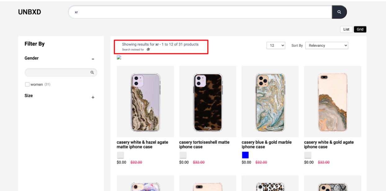
In such cases, the context-aware algorithm of Unbxd understands your visitor’s intent and sends a “Did You Mean” response along with a search result set for the query, if any.
You can configure the spellcheck feature by updating the required configs under the “spellCheck” config object.
|
OPTIONS |
DATATYPE |
DEFAULT VALUE |
DESCRIPTION |
|
enabled |
Boolean |
true |
Turn this flag on for enabling spell check |
|
el |
Element |
null |
Element in which to render the spellcheck component |
|
template |
Function |
Customise the look and feel of the spellcheck component by returning your custom HTML string from this function. This function gets 3 parameters: the search query, the suggested query text and a config object with product count details ({start, productsLn, numberOfProducts}) |
|
|
selectorClass |
String |
“UNX-suggestion” |
Additional CSS class name for the spell check component |
Sample “spellCheck” config
spellCheck:{
       enabled:true,
       el:document.getElementById("didYouMeanWrapper"),
       template: function(query,suggestion,pages) { return ``},
       selectorClass: "UNX-suggestion"
   }
To render the breadcrumb component, set the “breadcrumb” config object.
The following options are available under the object:
|
OPTIONS |
DATATYPE |
DEFAULT VALUE |
DESCRIPTION |
|
enabled |
Boolean |
true |
Turn this flag on if you want to show breadcrumbs (if it is available) on your page |
|
el |
Element |
null |
Element in which to render the breadcrumbs |
|
template |
Function |
Customise the look and feel of the breadcrumb component by defining this function that is expected to return a HTML string for the template. You will get the breadcrumbs list as parameter to this function |
|
|
selectorClass |
String |
“bread-crumb” |
Additional CSS class name for each breadcrumb item |
Configure variants display by setting the “variants” config object.
The following options are available under the object:
|
OPTIONS |
DATATYPE |
DEFAULT VALUE |
DESCRIPTION |
enabled |
Boolean |
false |
Turn this flag on for enabling variants |
count |
Number |
5 |
Indicates the number of variants to be shown |
|
groupBy |
String |
“v_colour” |
Variants will be grouped based on this field value. The name of the field has to be the same one as in your catalog |
|
attributes |
Array |
[“title”, “v_imageUrl”] |
List of fields you need for each variant |
|
mapping |
Object |
{“image_url”: “v_imageUrl”} |
Field mapping of the catalog attributes to the variant attributes. This is needed to render the variant information correctly. |
Sample “variants” config
variants:{
        enabled:false,
        count:5,
        groupBy:'v_colour',
        attributes:[
            "title",
            "v_imageUrl"
        ],
        mapping:{
            "image_url":"v_imageUrl"
        }
    },
Configure swatches display by using the configs in this section.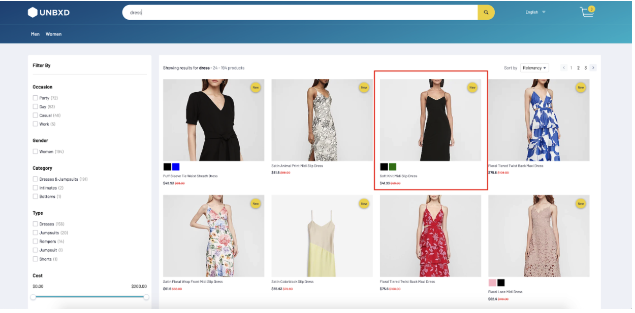
The following options are available under the object:
|
OPTIONS |
DATATYPE |
DEFAULT VALUE |
DESCRIPTION |
|
enabled |
Boolean |
false |
Turn this flag on for enabling swatches |
|
attributesMap |
Object |
{swatchImgs: “unbxd_color_mapping”, “swatchColors”: “color”, “swatchList”: “color”} |
Field mapping of the catalog attributes to the swatch attributes |
|
swatchClass |
String |
“UNX-swatch-btn” |
Additional CSS class name for the swatches |
|
template |
Function |
Customise the look and feel of the swatches component by returning your custom HTML string from this function. This function gets the current swatch data and complete swatches list as parameters |
Sample “swatches” config
swatches:{
       enabled:true,
       attributesMap:{},
       swatchClass:'UNX-swatch-btn',
       template:function(swatchData) {
           const {
               swatchColors = [],
               swatchImgs = []
           } = swatchData;
           let btnUI = ``;
           swatchColors.forEach((item,id) => {
               const imgId = swatchImgs[id];
               if(imgId){
                   const img = imgId.split("::")[1];
                   btnUI+= [`<button data-swatch-id="${item}" data-swatch-img="${img}" data-action="changeSwatch"`,
 `data-swatch-target=".UNX-img-block" class="${this.swatchClass}" style="background-color:${item}"> </button>`].join('')
               }
           });
           return `<div class="UNX-swatch-color-list">${btnUI}</div>`;
       }
   }
Configure the banner display by setting the “banner” config object.
The following options are available under the object:
|
OPTIONS |
DATATYPE |
DEFAULT VALUE |
DESCRIPTION |
|
enabled |
Boolean |
false |
Turn this flag on for enabling Banner |
|
el |
Element |
null |
Element in which to render the Banner component |
|
template |
Function |
Customise the look and feel of the banner component by returning your custom HTML string from this function. This function get the list of banners as the parameter. |
|
|
count |
Number |
1 |
Indicates the number of banners to be shown |
- Did this answer your question?
